Friday, November 22, 2013

Alpine Team


Super fun project quite a while ago designing some playsets for an unannounced title. I was listening to At The Mountains of Madness audiobook while working on these (perhaps Ill post the other pages some other time) - if you havent listened or read that story, I cant recommend it enough. It gets a little crazy and hard to follow towards the end when they start encountering C'Thulu-ish habitants up in the lost city, but up until that point and especially the first half is absolutely incredible. Discovery of lost cities is probably the most compelling topic ever. At least to me.

Tuesday, November 19, 2013

Sketching tugs at South St. Seaport


I've been trying out the video recording feature on Instagram to record some sketching. It doesnt always work out because you need to get it right all in basically one take, but I imagine it's super satisfying when you nail it.
Anyone recording any sort of sequential art on instagram? Give it a shot and send me a link!


 Starting out with everything you need and a nice location is the first step.

Some blue pencil action,

Drop a quick in a quick value with a watered down brush pen,

Ink it with a .5 Hightec,
Another value over the top letting that ink layer bleed.

Erase the blue pencil and lay in a background,

...a little white goauche and done!
10-15 minutes.


Sunday, November 17, 2013

Kazuo Oga Exhibition Catalog

This guy. This is THE guy. I came to know him first from all the backgrounds from the Studio Ghibli films but after seeing this catalog from his exhibition at the Museum of Contemporary Art Tokyo in 2007 (and touring Japan 2008-2010), it turns out he was also a background artist on countless OAV's from the 80s and early 90s. Demon City, Harmegedon, Dagger of Kamui to name just a few. Oh man, Demon City freaked me out back in 89. So fascinating to reminisce about how niche these videos were back then. Videos as in vcr tapes. Anyways, this catalog is pretty cool- to be honest besides the old 80s oav stuff,  and there's not a ton, I've already seen just about every background in this book from either the Studio Ghibli Art of Books, or the two volumes of Oga Kazuo Art Collection- but its nice to have everything all together in one rare exhibition catalog- plus Im just a huge fan of his so I had to pick it up. Ordered from Japan for a little over $100.00 I think.

A Ghibli Artisan - Kazuo Oga Exhibition - The One Who Painted Tototro's Forest
(Jiburi no Eshojunin Jiburi no Eshokunin - Oga Kazuo - Totoro no Moki o Kaita Hito)
TMW Publishing
268 Pages (SC)
ISBN-10: 4-88660-431-5
8.5 x 11.5 x .75

Friday, November 15, 2013

Magnetic Travel Games

About a year and a half ago I helped rebrand these Magnetic Travel Games for Barnes and Noble and I'm going to share some of the process.

Here is one of the games- there were four of them, Hangman, Chess, Checkers and oddly enough, Tic Tac Toe (which I recall was the best seller of the 4- which still comes to a shock to me).
As you can see just about anything I would do would be better than the existing art.


Since they're are of a set, the backgrounds would change but the foreground element would stay the same.


Planes Trains and Automobiles was WAY too busy, so I simplified down to just the car.


I also thought there was an opportunity to add another dimension to the game by giving the players an opportunity to mix and match attributes of the person they're hanging- there's plenty of room on the die to add character parts- this all turned a little tricky cause no one wants to hang a nice guy. Everyone hates zombies so I first considered making a couple different zombies you could hang instead of the stick figure of the original version of this game.


At this point the feedback I was getting was we needed more of a "travel character", the car wasnt character enough so I started generating a series of possible character designs to present to the client.


What says Magnetic Travel? A magnet? A globe?


Can we change the accessories to fit that character into each of the game types? 


Not a great response on the Magnet guy, so I came up with a few more..
... and picked the ones I liked and showed how they would translate across the different game types.


Not a great response on the kids, not saying travel enough apparently, so we settled on going back to 
the family car out on vacation.


Each of the Games needed its own unique font colors, so thats when I did a series of color combos for each game and font- here above are some of the options for the Hangman.
One thing that came up at this point was the needed to add a Chocking Hazard Warning label which is actually pretty specific in how big it needs to be and where its displayed. Pretty tricky trying to figure out which Government Department handles those regulations but figured it out and attempted to decipher the legal documents guidelines. Would of helped if I had a law degree but managed to decode what they needed to have. Like I said- it was very specific.
Ack! Totally messed up our composition adding that! Everything was fitting well until now. No biggeee though- we just did what we could to fit it in, besides with our manufacturing deadline quickly passing us there wasn't time to go back and get all new artwork approved.


Still hemming and hawing over who the characters we were going to hang were going to be. When my sister and I were kids we would draw a hangman game on paper and customize the characters- it was the best part of the game. These are a few of the characters -and also just making sure the parts would fit on the playing board. which was the inside of the game tin.


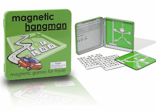
And heres the final Hangman art- the other 4 games, Chess, Checkers and Tic Tac Toe are all on the shelves at Barnes and Noble, $8.95 I think- so next time youre wandering the game isles at Barnes, take a gander. They came out looking pretty slick with the blister backing and fitted plastic blister- at some point I will update this image with an actual photograph of one of the games, but it looks almost exactly like this!


Tuesday, November 12, 2013

The Art of the Croods


Art of the Croods! I don't think I saw the end but I thought this feature had a great art team. The character animation was super good- lots of action happening in the background away from the spotlight. The environments, which this book highlights quite well, had a great sense of scale, were all very pretty, lush and imaginative. This is definitely your standard "art of book", character designs (man, Carter Goodrich must have a character design credit for EVERY animated film in the last 10 years) and background paintings, with the weight leaning towards background art. Im a big layout fan so I really enjoyed this book.

The Art of The Croods
Noela Hueso
Titan Books (March 26, 2013)
176 Pages (HC)
11 x 10 x 1 inches
ISBN-10 1781164118

Well worth the $24 on amazon